Bloom & Beyond
Urban Greenary Subscriptions For Busy Creatives

MINIMAL &
REFINED
Improving Mental & Phyical Health Through Greenary In Urban Enviroments
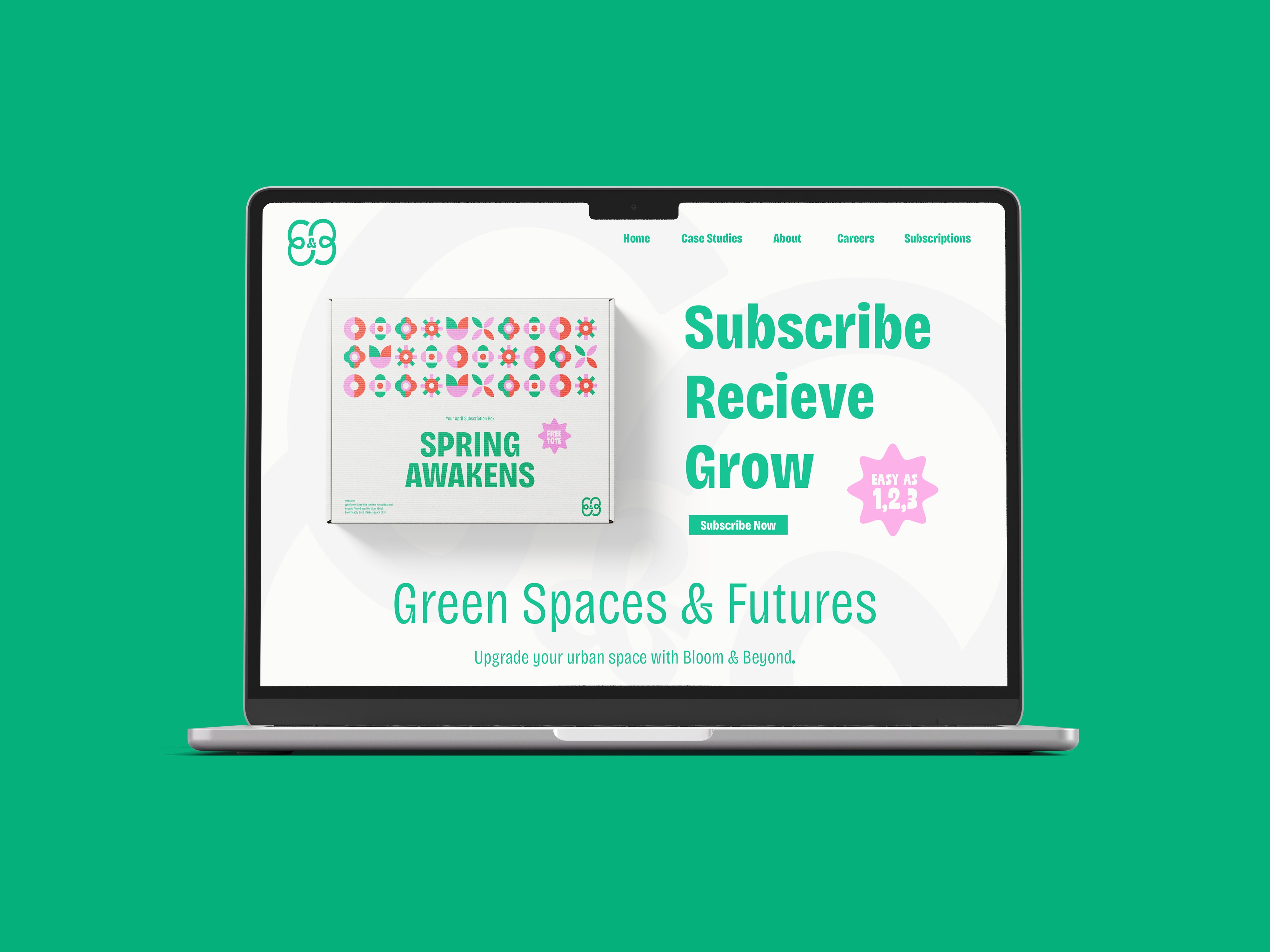
Many creative professionals live in urban spaces with little to no greenery, impacting their mental and physical well-being. Bloom & Beyond offers a sustainable solution with a subscription service that delivers greenery alongside simple care and installation instructions, making plant life more accessible and improving both personal and environmental health.
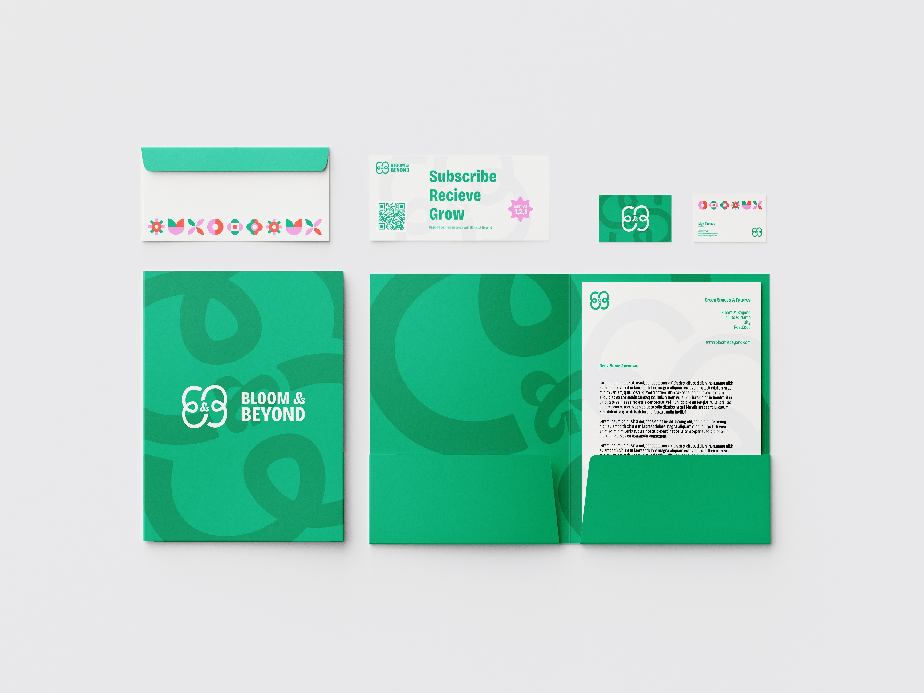
The brand identity is designed to captivate a visually-driven audience of creative professionals. The primary typeface, Bricolage Grotesk, balances sleek sophistication with a slightly unconventional edge, resonating with creatives. Strong character shapes command attention and reinforce the brand’s messaging in a bold, distinctive way.
Since this audience leads busy lives, the brand identity is designed to instantly draw them in, combining an engaging geometric illustration based visual presence with clear, benefit-driven messaging.
The tone is expert yet approachable, instilling trust while maintaining a casual, friction-free experience. The logo merges the brand’s initials into a stylized flower, making it both unique and recognisable. Its minimalist, square-based design ensures scalability and adaptability across various applications, strengthening brand familiarity.


Bloom & Beyond
Urban Greenary Subscriptions For Busy Creatives
MINIMAL &
REFINED
Improving Mental & Phyical Health Through Greenary In Urban Enviroments
Many creative professionals live in urban spaces with little to no greenery, impacting their mental and physical well-being. Bloom & Beyond offers a sustainable solution with a subscription service that delivers greenery alongside simple care and installation instructions, making plant life more accessible and improving both personal and environmental health.
The brand identity is designed to captivate a visually-driven audience of creative professionals. The primary typeface, Bricolage Grotesk, balances sleek sophistication with a slightly unconventional edge, resonating with creatives. Strong character shapes command attention and reinforce the brand’s messaging in a bold, distinctive way.
Since this audience leads busy lives, the brand identity is designed to instantly draw them in, combining an engaging geometric illustration based visual presence with clear, benefit-driven messaging.
The tone is expert yet approachable, instilling trust while maintaining a casual, friction-free experience. The logo merges the brand’s initials into a stylized flower, making it both unique and recognisable. Its minimalist, square-based design ensures scalability and adaptability across various applications, strengthening brand familiarity.