Pixel Perfection
Maintaining Traditional Art Practices In The Digital Age

Merging
worlds
Combining Traditional Practices With Modern Technology To Offer Unique Art Direction
As technology evolves, so does the way artists work. Traditional art practices, with their unique, unrepeatable outcomes, risk fading as the current generation retires. Pixel Perfection is changing that by blending traditional techniques with digital processes, offering clients one-of-a-kind creative solutions that stand out and preserve artistic traditions for future generations.
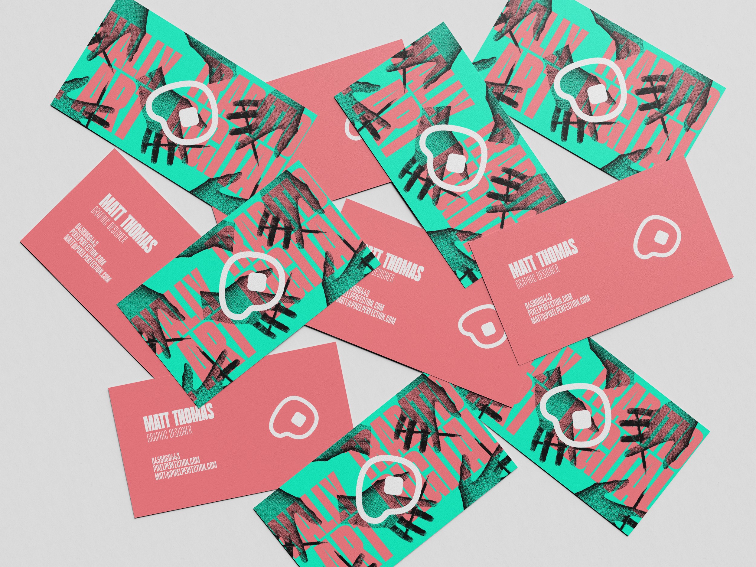
Old-school letterpress typography and halftone imagery, showcase the brand's commitment to honouring traditions past, which automatically appeal to the emotional side of people who also value traditional art practices. It is also wildly different from clean cut competitors in the digital art & design studios space.
Combining this approach with vibrant contemporary colours further demand attention & showcase the studio's ability to merge the 2 worlds in their artwork. By clearly communicating their skills and values in their identity, Pixel Perfection builds trust and credibility, making them a go-to choice in the industry.
The identity is focused around a logo that is minimal, sleek and acts as a recognisable identifier for the wider brand due to its hidden meaning. The logo holds the shape of a P & Pixel which reference the brand name, which also combine to create and artists' palette, referencing the service they provide. The logo is massively scalable, maintaining its identity at all sizes furthering brand recognition.
Flexible brand assets ensure that every piece maintains the studio’s recognisable ‘vibe’, increasing familiarity and connection across all touch points.


Pixel Perfection
Maintaining Traditional Art Practices In The Digital Age
Merging
worlds
Combining Traditional Practices With Modern Technology To Offer Unique Art Direction
As technology evolves, so does the way artists work. Traditional art practices, with their unique, unrepeatable outcomes, risk fading as the current generation retires. Pixel Perfection is changing that by blending traditional techniques with digital processes, offering clients one-of-a-kind creative solutions that stand out and preserve artistic traditions for future generations.
Old-school letterpress typography and halftone imagery, showcase the brand's commitment to honouring traditions past, which automatically appeal to the emotional side of people who also value traditional art practices. It is also wildly different from clean cut competitors in the digital art & design studios space.
Combining this approach with vibrant contemporary colours further demand attention & showcase the studio's ability to merge the 2 worlds in their artwork. By clearly communicating their skills and values in their identity, Pixel Perfection builds trust and credibility, making them a go-to choice in the industry.
The identity is focused around a logo that is minimal, sleek and acts as a recognisable identifier for the wider brand due to its hidden meaning. The logo holds the shape of a P & Pixel which reference the brand name, which also combine to create and artists' palette, referencing the service they provide. The logo is massively scalable, maintaining its identity at all sizes furthering brand recognition.
Flexible brand assets ensure that every piece maintains the studio’s recognisable ‘vibe’, increasing familiarity and connection across all touch points.